

8 CSS Units to Make your Site Responsive

Hello, I'm a Frontend engineer with a passion for learning new tech, writing blogs, and sharing my knowledge with others.
Apart from coding, I love staying up-to-date with the latest trends and tools in the tech industry. I'm always learning and exploring new technologies and techniques to improve my work and create more efficient and scalable solutions.
I enjoy sharing my knowledge with others through writing blogs and creating courses. Recently, I created a course for Educative on React.
As a freelancer, I'm seeking projects related to Shopify and React. I enjoy working on projects that challenge me and help me grow as a developer.
Today, We live in the world of gadgets. With so many gadgets there are so many screens that too of different sizes from 4" to 13" or larger. You can find a screen of almost any size.
So to provide the contents to the consumer using any type of screen is the responsibility of a developer. This is possible only by using the proper Relative Size Units. And therefore here we will learn about those 8 Units.
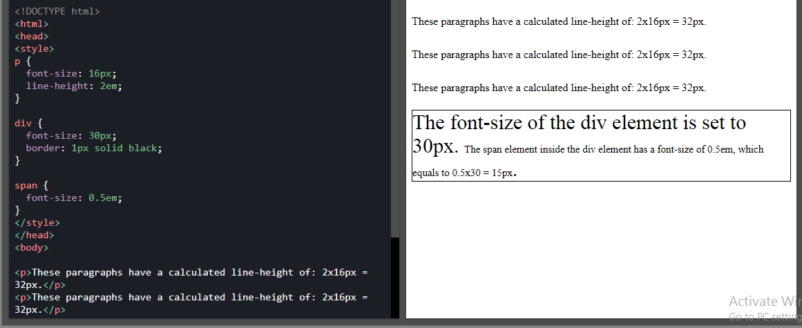
1. em
It is relative to the font-size of the parent.2em means 2 times the size of the current font.
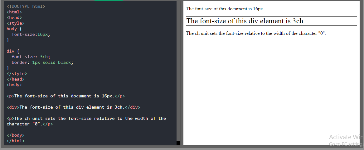
2. ch
It is relative to the width of the "0" (Zero).
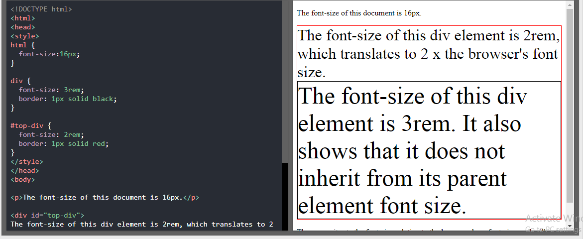
3. rem
It is relative to the font size of the root element.
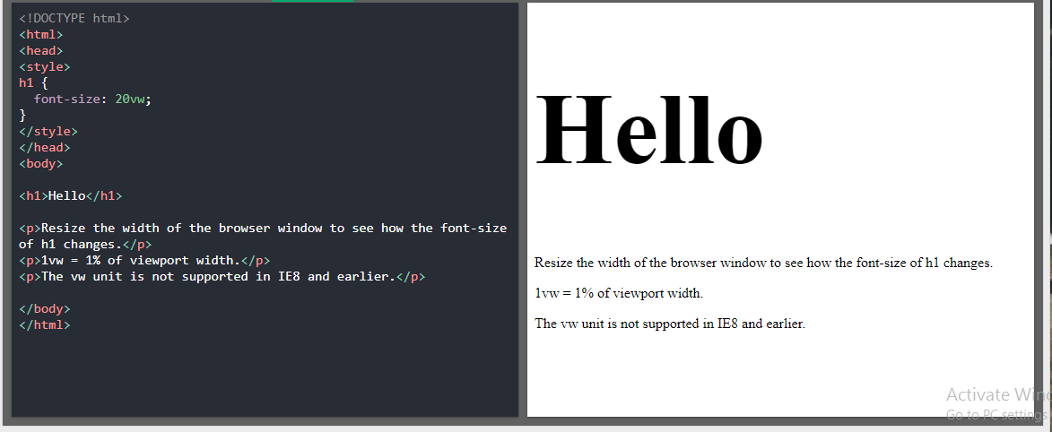
4. vw
It is relative to 1% of the width of the viewport.
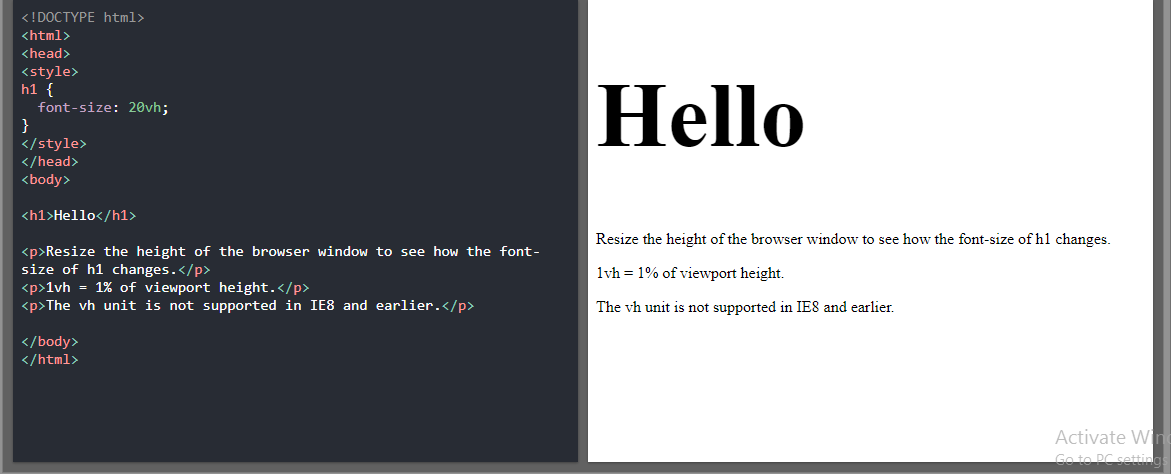
5. vh
It is relative to 1% of the height of the viewport.
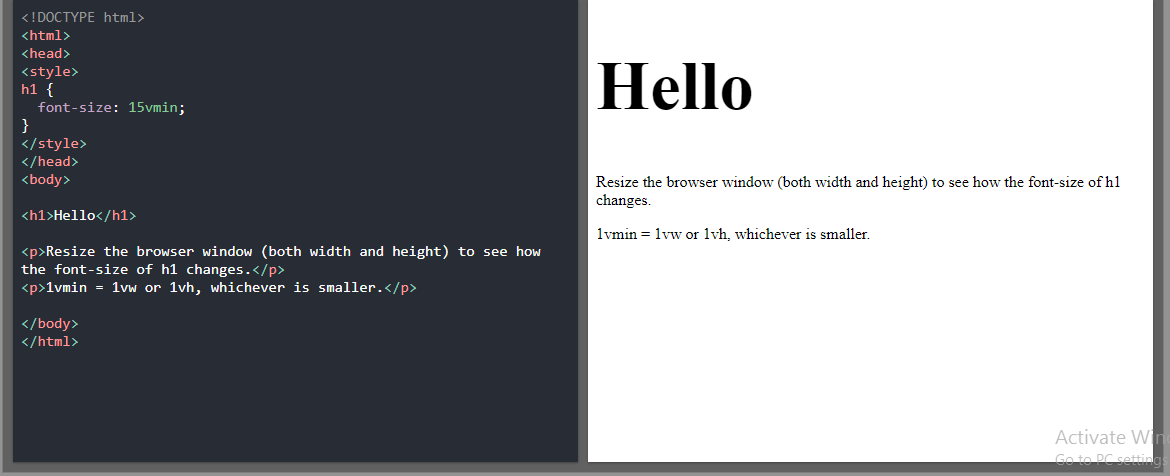
6. vmin
It is relative to 1% of the viewport's smaller dimension.
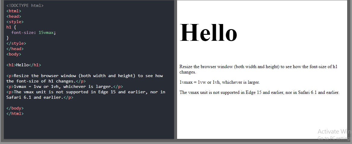
7. vmax
It is relative to 1% of viewport's larger dimension.
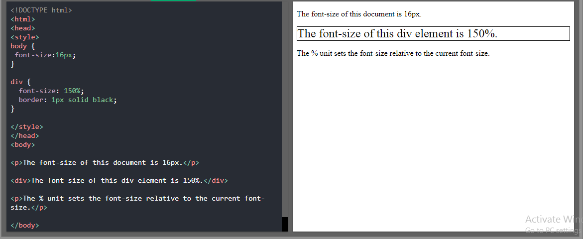
8. %
It is relative to the parent element.
Tip:
- The em and rem units are practical in creating a perfectly scalable layout!
- Viewport = the browser window size. If the viewport is 50cm wide, 1vw = 0.5cm.
That's all for this blog. If you learned from this blog Do Like it and SHARE it with your friends.
We will meet in the Next Blog Until then Keep Learning, Keep Growing.
Reference: W3Schools
Connect with me 👇
| Gmail | DEV | ||
 |  |  |  |


